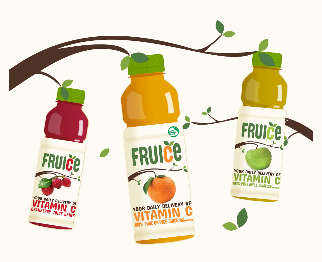
The original concept for the new Fruice brand. The overall structure, typography and colour scheme were kept. The Fruice Bird concept used a character that was comprised of a drop of juice with elements of the other variants incorporated to form the shape of a bird. An illustration of fruit was used to represent the variant flavour. A bird was chosen as they're a natural character in nature, living amongst the fruit where it grows. 330ml bottles Orange Juice, Cranberry Juice and Apple Juice.
The initial core range of juices released in 2017. As you can see, the overall structure, typography and colour schemes were kept but instead of a character, a combination of illustration and photography were used to illustrate a piece of fruit ready to be picked from a branch. This fresh and youthful style reflect the brand values, appeals to the consumer and continues to have real shelf stand-out.
Fruice 330ml Orange Juice - I kept the orchard theme going around the pack by using a branch themed frame for the brand story and creating a little fruit icon for the 'Source of Vitamin C' message on the back of pack. Each design is colour coded in accordance with the fruit content variant.
Fruice 330ml Cranberry Juice Drink
Fruice 330ml Apple Juice
Fruice 250ml & 200ml cartons
  

More in this collection

Back to Top